# Dashboard Design
Screenshots on this page are taken from the Chinese UI. Menu, field and button names in the text use the English UI labels.
A dashboard is usually a visual interface in a system that gives an overview of key data and metrics. It typically presents information as charts, graphics and numbers, helping users monitor and understand the system's status, performance or other key indicators at a glance.
This system supports customizing dashboards to display charts, statistic values, tables, links, text descriptions and more.
# Target Audience
This document is intended for developers and implementers of this system, or advanced users interested in customizing dashboards.
# Dashboards on the Home Page
After logging in, users land on the home page, where the system lists every dashboard the current user is allowed to view as tabs. Click a tab to switch dashboards; the Fullscreen button in the upper right corner shows the current dashboard in full screen.
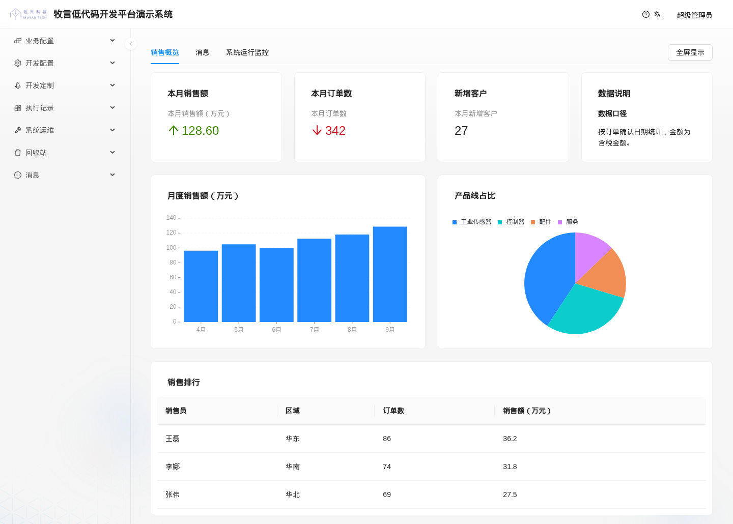
The figure below shows a sample dashboard named "销售概览" (Sales Overview), containing 3 STATISTIC widgets, 1 MARKDOWN widget, 1 column chart, 1 pie chart and 1 DATA_TABLE widget:
TIP
The home page only displays dashboards; it has no buttons for creating or editing dashboards or widgets. Both dashboards and widgets are maintained under the System Config > Dashboards menu, as described below.
If the current theme (System Config > UI > Themes) configures a custom home page (landingPage), the home page shows that form instead of the dashboards.
# Overview
A dashboard consists of two parts:
- Dashboard: a form of type
DASHBOARD, maintained inSystem Config > Dashboards > Dashboards; - Dashboard widget: a display unit attached to a dashboard, maintained in
System Config > Dashboards > Widgets. Each widget returns the data to display through a core logic (Dynamic Logic).
# Create a Dashboard
Go to System Config > Dashboards > Dashboards and click the Create button at the upper right of the list. The create form looks like this:
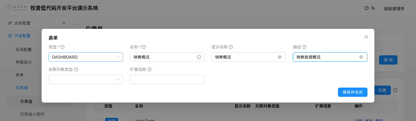
The fields are described below:
| Field | Description |
|---|---|
| Type (type) | Required. Select DASHBOARD when creating a dashboard |
| Name (name) | Required. The dashboard name, a unique identifier that cannot be changed after creation |
| Label (label) | The name shown on the dashboard's tab on the home page; the Name is shown when empty |
| Description (description) | Description of the dashboard |
| Object type (objectType) | Leave empty when creating a dashboard |
| Extend information (extInfo) | Extended information of the dashboard in JSON format; can be left empty |
# Dashboard Visibility
Which users can see a dashboard on the home page is determined by the form's accessRequirement (the access requirement, which references a RoleRequirement):
- When
accessRequirementis empty, all logged-in users can see the dashboard; - When it is set, only users who meet the requirement can see the dashboard and read its widget list.
This field is not on the create form. Set it through the last column accessRequirement.name of the seed data file DynamicForm.csv, for example:
name(*),label,description,objectType.shortName(*),type.name(*),formHook.name,formHookTriggerFields,dataHook.name,extInfo,accessRequirement.name
销售概览,销售概览,销售数据概览,,DASHBOARD,,,,,USER
2
TIP
Permission to create, modify or delete a dashboard depends on whether the user has the corresponding permission on the DynamicForm object (DEVELOPER by default); permission to add a widget depends on whether the user has create permission on the DynamicDashboardWidget object (DEVELOPER by default).
WARNING
In the current version, the System Config > Dashboards > Dashboards list shows forms of all types in the system, not only DASHBOARD forms. Find dashboards by looking for DASHBOARD in the "Type" column.
# Add a Widget
Go to System Config > Dashboards > Widgets and click the Create button. The create form looks like this:
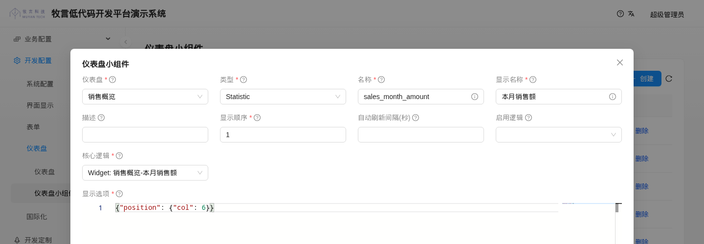
The fields are described below:
| Field | Description |
|---|---|
| Form (form) | Required. The dashboard this widget belongs to |
| Type (type) | Required. The widget type, which determines how the widget is rendered in the frontend; see Supported Widget Types |
| Name (name) | Required. The widget name, a unique identifier that cannot be changed after creation |
| Label (label) | Required. The title shown in the upper left corner of the widget card |
| Description (description) | Description of the widget |
| Display sequence (displaySequence) | Required. Smaller values come first |
| Refresh interval(Seconds) (refreshInterval) | Reserved field. The frontend currently does not refresh automatically at this interval; see the note below |
| Enable logic (enableLogic) | Dynamic logic that controls whether the widget is shown; the widget is hidden when it returns false, and always shown when empty |
| Core logic (coreLogic) | Required. Dynamic logic that prepares the data and display configuration for the widget |
| Options (options) | Required. A JSON string holding the widget's width and display configuration; see Widget Display Options. Enter {} when there is no special configuration |
WARNING
In the current version, the frontend requests widget data only once when the dashboard is opened. It does not refresh automatically according to "Refresh interval(Seconds)" or the refreshInterval in the dashboard's extInfo; reopen the page to refresh.
- The type dropdown shows the English names of the types (for example
Statistic,Column chart), which correspond one-to-one to the enum values in the table below. - For how to write the enable logic and core logic, see Widget Dynamic Logic.
Widgets can also be imported through the seed data file DynamicDashboardWidget.csv, with the following columns:
name(*),label,displaySequence,description,form.name,enableLogic.name,coreLogic.name,type,options
sales_month_amount,本月销售额,1,,销售概览,,Widget: 销售概览-本月销售额,STATISTIC,"{""position"": {""col"": 6}}"
2
# Modify and Delete Widgets
Widgets on the home page have no action menu. To modify or delete a widget, find it in the System Config > Dashboards > Widgets list and click Update or Delete. To modify the code of the core logic, find the corresponding dynamic logic in Development > Logics > Logics and edit it there.
# Built-in Dashboards
The system seed data includes two built-in dashboards:
| Dashboard | Visibility | Description |
|---|---|---|
| 消息 (Messages) | USER (all regular users) | Overview of the current user's messages |
| 系统运行监控 (System Operation Monitoring) | DEVELOPER | 18 widgets in total, summarizing the success rate, result distribution and recent run errors of all kinds of customizations (actions, object hooks, data imports, scheduled tasks, etc.), as well as invalid menu definitions |
The dashboard tab names come from seed data and are shown in Chinese in the English UI.
The layout of the "消息" dashboard is as follows:
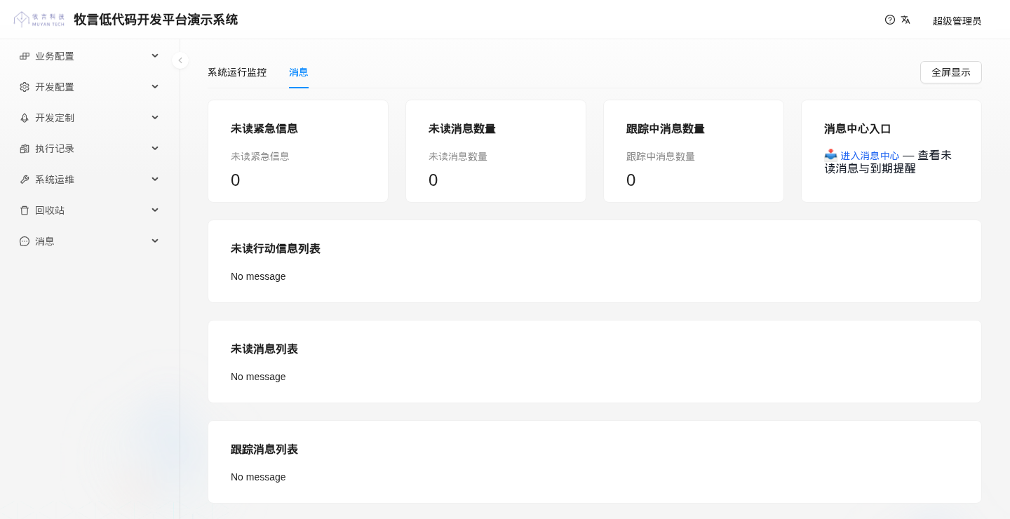
- The first row contains 4 cards, each taking 1/4 of the width (col 6): three statistic values, "未读紧急信息" (unread urgent messages), "未读消息数量" (number of unread messages) and "跟踪中消息数量" (number of tracked messages), and "消息中心入口" (Message Center Entry). These widget titles come from seed data and are shown in Chinese in the English UI. Clicking its 进入消息中心 (Enter Message Center) link opens
消息 > 消息中心(this menu is still displayed in Chinese in the English UI). - Below are 3 full-width (col 24) message lists: "未读行动信息列表" (unread action messages), "未读消息列表" (unread messages) and "跟踪消息列表" (tracked messages). When a list is empty, it shows "No message" (this text is returned by the built-in core logic).
In "消息中心入口", the font of the "进入消息中心" link is smaller than the text after it. This is a UI issue in the current version: the widget returns a level-3 Markdown heading, but the frontend's global styles fix the font size of all links (14px), so the link is not enlarged with the heading.
# Widget Display Width and Line Wrapping
When laying out widgets horizontally, the system divides the full available width into 24 grid columns, and each widget can be given a display width from 1 to 24. The system sorts widgets by display sequence, calculates how many widgets fit in each row based on their width settings, and ensures that the total width of all widgets in a row does not exceed 24. If the remaining grid width in a row is not enough for the next widget, that widget moves to the next row.
The display width is stored in the Options (options) field and is specified with JSON like this:
// "col": 8 means the widget takes 8 horizontal grid columns, i.e. 1/3 of the full width
{"position": {"col": 8}}
2
TIP
If no width is specified in the options, the widget's default width is 8, taking 1/3 of a row.
The width adapts to the screen size:
- On small screens (narrower than 768px, i.e. antd's xs and sm breakpoints), every widget takes a full row (24);
- On medium screens (md breakpoint, 768px ~ 992px), the width is at least 12 (half a row); a configured value greater than 12 is used as is;
- On large screens (lg and above), the configured value is used.
# Widget Display Height
All widgets displayed in the same row have the same height.
# Widget Display Options
The display options (options) is a JSON string that defines the widget's display configuration, including the width and other settings that only apply to specific widget types.
position.col: display width, see the previous section;style: CSS style of the widget's outer card (Card);config: passed without any modification to the React component that renders the widget in the frontend.
In the options below, the JSON object {"xField": "month", "yField": "amount"} is passed as is to the chart component that renders the widget:
{"config": {"xField": "month", "yField": "amount"}, "position": {"col": 12}}
# Widget Dynamic Logic
# Enable Logic
Whether a widget is shown is controlled by the widget's enable logic.
The enable logic is a dynamic logic of logic type DASHBOARD_WIDGET_ENABLE_LOGIC (displayed as "Dashboard Widget Enable Logic" in the UI).
# Injected Variables
When the frontend fetches the widget list of a dashboard, the enable logic of each widget is executed first; if the result is not true, the widget is not returned. The variables injected at runtime are listed below:
# Return Value
The customization code must return a Map<String, Boolean> object containing an element with the key result, for example:
// Indicates whether this dashboard widget is enabled (the enable logic of an object action returns [enableIds: [...]] and does not use this structure)
[result: true | false]TIP
If a widget's enable logic is empty, the widget is shown by default.
# Core Logic
The system uses the widget's core logic to generate the data to display and the related display properties, and passes them to the frontend.
The core logic is a dynamic logic of logic type DASHBOARD_WIDGET_CORE_LOGIC (displayed as "Dashboard Widget Core Logic" in the UI).
# Injected Variables
The variables injected when the core logic runs are the same as for the enable logic:
In addition, the request parameters of the HTTP request that reads the widget data (GET /dashboard/widget/data/{id}) are also injected.
# Return Value
The core logic returns an object of type Map<String, Object>, which the system passes directly to the frontend. When rendering, the frontend converts the Map into a JSON object and merges it with the default properties defined in the frontend rendering component and with the JSON object under the config key in the display options. The merged result is used as the property set of the widget's rendering component.
For example:
- The widget's display options are as follows, where
xFieldsets the chart's x-axis tomonthandyFieldsets the y-axis toamount
{"config": {"xField": "month", "yField": "amount"}, "position": {"col": 12}}
- The core logic returns the following Map
return [
  data: [
    [month: "8月", amount: 118.0],
    [month: "9月", amount: 128.6],
  ],
  legend: false,
]
2
3
4
5
6
7
The properties finally passed to the frontend chart component are the merge of these two sources: xField and yField come from the display options, and data and legend come from the core logic's return value:
{
  "xField": "month",
  "yField": "amount",
  "data": [
    {"month": "8月", "amount": 118.0},
    {"month": "9月", "amount": 128.6}
  ],
  "legend": false
}
2
3
4
5
6
7
8
9
# Widget Types in Detail
# Supported Widget Types
The system currently supports the following 20 widget types (the DashboardWidgetType enum):
| Type | Name in dropdown | Description | Internal rendering component |
|---|---|---|---|
| MARKDOWN | Markdown content | A piece of Markdown content | Rendered with react-markdown (opens new window) |
| HTML | Html content | A piece of HTML content | Displays a piece of HTML content |
| COUNTDOWN | Countdown | A countdown component | Statistic (opens new window) |
| STATISTIC | Statistic | Displays a single statistic value | Statistic (opens new window) |
| DATA_TABLE | Data table | Displays a table | Table (opens new window) |
| PIE_CHART | Pie chart | Pie chart | Pie (opens new window) |
| LINE_CHART | Line chart | Line chart | Line (opens new window) |
| COLUMN_CHART | Column chart | Column chart | Column (opens new window) |
| GAUGE_CHART | Gauge chart | Gauge chart | Gauge (opens new window) |
| LIQUID_CHART | Liquid chart | Liquid chart | Liquid (opens new window) |
| BULLET_CHART | Bullet chart | Bullet chart | Bullet (opens new window) |
| AREA_CHART | Area chart | Area chart | Area (opens new window) |
| BAR_CHART | Bar chart | Bar chart | Bar (opens new window) |
| PROGRESS_CHART | Progress chart | Tiny progress bar | Tiny.Progress (opens new window) |
| RING_PROGRESS_CHART | Ring progress chart | Tiny progress ring | Tiny.Ring (opens new window) |
| TINY_AREA_CHART | Tiny area chart | Tiny area chart | Tiny.Area (opens new window) |
| TINY_LINE_CHART | Tiny line chart | Tiny line chart | Tiny.Line (opens new window) |
| TINY_COLUMN_CHART | Tiny column chart | Tiny column chart | Tiny.Column (opens new window) |
| BI_DIRECTION_BAR | Bi direction bar | Bidirectional bar chart | BidirectionalBar (opens new window) |
| HISTOGRAM | Histogram | Histogram | Histogram (opens new window) |
Some widget types have specific settings or usage notes, described below.
# Properties of Non-Chart Widgets
# Markdown and Html Widgets
The core logic of Markdown and Html widgets returns the following structure:
// A Map with key data whose value is the text to display
return [data: "**数据口径**\n\n按订单确认日期统计,金额为含税金额。"]
2
The Html widget merges the properties in the options' config with the properties returned by the core logic (other than data) and applies them to the div that wraps the HTML content, so the overall style can be set through style. It can be written in the display options:
{
  "config": {
    "style": {
      "color": "red",
      "fontSize": "32px",
      "textAlign": "center"
    }
  },
  "position": {"col": 8}
}
2
3
4
5
6
7
8
9
10
It can also be set through the style field in the core logic's return value:
return [
  data : "<b>Hello World</b>",
  style: [
    // Optional CSS styles
    fontSize: "12px"
  ]
]
2
3
4
5
6
7
TIP
The Markdown widget supports the GFM spec (opens new window) through remark-gfm (opens new window), including extensions such as tables, task lists and strikethrough. The Markdown widget does not support styling through config or style, and does not render mermaid code blocks.
In a Markdown table, the header row, delimiter row and data rows must have the same number of columns; otherwise the whole table is displayed as plain text.
WARNING
In the current version, the frontend's global styles remove the list markers of ul and ol, so unordered and ordered lists in a Markdown widget show no bullets or numbers, only indentation. To list items one by one, write the numbers or "·" manually at the start of each line and end each line with two spaces for a line break.
# Countdown Widget
The following is an example of the return value structure of a countdown widget's core logic:
import java.time.LocalDate
import java.time.ZoneId

long target = LocalDate.of(2026, 12, 31)
  .atStartOfDay(ZoneId.of("Asia/Shanghai")).toInstant().toEpochMilli()

return [
  // title is the countdown title shown in the UI; always returning it is recommended
  // (when it is not returned, the default title Countdown is shown)
  title : '距年度盘点',
  // value is the countdown target time (millisecond timestamp); the system generates the countdown display from the current time
  value : target,
  // Optional; the default format is "D 天 H 时 m 分 s 秒"
  format: 'D 天 H 时',
]
2
3
4
5
6
7
8
9
10
11
12
13
14
15
# Data Table Widget
The following is an example of the return value structure of a data table widget's core logic:
return [
  // data is the array of data to display; each element of the array is a Map
  // The structure below is rendered as a table with 3 columns in the frontend
  data: [
    [销售员: "王磊", 区域: "华东", 订单数: 86],
    [销售员: "李娜", 区域: "华南", 订单数: 74],
  ]
]
2
3
4
5
6
7
8
- Columns are taken from the keys of the first data row, and column titles are derived from the keys: camelCase names are split into words with the first letter capitalized (for example
orderCountis displayed asOrder Count), and Chinese keys are shown as is. - Cell content is rendered as HTML, so HTML fragments such as links can be returned.
- When an empty array is returned, the message "No data returned from backend" is shown.
- Properties in the options'
configare passed as is to the antd Table (opens new window), for example"pagination": falseturns off pagination. Because the key order of a Map is not necessarily preserved when returned to the frontend, specifyconfig.columnswhen you need a fixed column order or custom column titles:
{
  "config": {
    "pagination": false,
    "columns": [
      {"title": "销售员", "dataIndex": "销售员"},
      {"title": "区域", "dataIndex": "区域"},
      {"title": "订单数", "dataIndex": "订单数"}
    ]
  },
  "position": {"col": 24}
}
2
3
4
5
6
7
8
9
10
11
# Statistic Widget
The following is an example of the return value structure of a Statistic widget's core logic:
return [
  // title is the small caption above the statistic value
  title    : "本月销售额(万元)",
  // value is the value shown in the UI
  value    : 128.6,
  // Optional; number of decimal places, 2 by default
  precision: 2,
  // Optional; "up" or "down", showing a green up arrow or a red down arrow respectively
  direction: "up",
]
2
3
4
5
6
7
8
9
10
The widget's appearance and how each part maps to the return value are shown below:
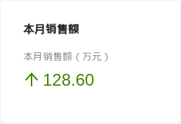
- The bold "本月销售额" in the first line is the widget's Label (label);
- The gray "本月销售额(万元)" in the second line is the
titlereturned by the core logic; - The value
128.60comes fromvalue, with 2 decimal places according toprecision; - The green up arrow comes from
direction: "up".
# Chart Widgets
All chart widgets are rendered with the Ant Design Charts (opens new window) library, and only the chart types listed in the table above are currently supported.
When a chart widget is rendered, the config part of the display options is merged with the top-level keys of the Map returned by the core logic, and the merged result is passed directly as parameters to the Ant Design Charts rendering component.
Compatibility note
Both the display options and the core logic's return value are JSON, so rendering properties of the JavaScript callback function type are not supported.
# Chart Axis Settings
For chart types with axes, the axis settings must be included in the display options or the core logic's return value; otherwise the chart may be empty or display incorrectly.
- Set in the display options
{"config": {"xField": "month", "yField": "amount"}, "position": {"col": 12}}
- Return directly from the core logic
return [
  xField: "month",
  yField: "amount",
  data  : [
    [month: "8月", amount: 118.0],
    [month: "9月", amount: 128.6],
  ]
]
2
3
4
5
6
7
8
The charts for which xField and yField are required are:
- Line chart LINE_CHART
- Area chart AREA_CHART
- Column chart COLUMN_CHART
- Bar chart BAR_CHART
- Bidirectional bar chart BI_DIRECTION_BAR (
yFieldis an array of two field names)
A pie chart uses angleField to specify the value field and colorField to specify the category field, for example:
{"config": {"angleField": "amount", "colorField": "line"}, "position": {"col": 12}}
# Data Properties of Charts
In the Ant Design Charts API, the name of the property that carries the data differs between charts. The table below lists the data property name of each chart for reference; for the exact value format, see the Ant Design Charts documentation.
| Chart type | Data property name |
|---|---|
| Line chart LINE_CHART | data |
| Area chart AREA_CHART | data |
| Column chart COLUMN_CHART | data |
| Bar chart BAR_CHART | data |
| Pie chart PIE_CHART | data |
| Gauge chart GAUGE_CHART | data, in the format {"target": current value, "total": total value} |
| Liquid chart LIQUID_CHART | percent (0 ~ 1) |
| Tiny progress bar PROGRESS_CHART | percent (0 ~ 1) |
| Tiny progress ring RING_PROGRESS_CHART | percent (0 ~ 1) |
| Bullet chart BULLET_CHART | data |
| Tiny area chart TINY_AREA_CHART | data |
| Tiny line chart TINY_LINE_CHART | data |
| Tiny column chart TINY_COLUMN_CHART | data |
| Bidirectional bar chart BI_DIRECTION_BAR | data |
| Histogram HISTOGRAM | data (binField is also required to specify the bin field) |
An example for the gauge chart (by default the frontend shows the percentage target / total in the middle):
return [
  data: [
    target: 86,
    total : 100,
  ]
]
2
3
4
5
6
TIP
The data-carrying property is required in the core logic's return value; otherwise the chart cannot be displayed.
Compatibility note
The Ant Design Charts version currently in use is 2.6.7 (v2). The configuration options of v2 differ considerably from v1, so widgets migrated from older versions need their configuration adjusted to the v2 API. If the properties above do not take effect, refer to the latest API of each chart in the Ant Design Charts documentation (opens new window).
# Notes
The following are notes and best practices for implementing dashboards.
# Priority of Widget Display Properties
When rendering a widget, the system merges the widget's core logic return value, the config in the display options, and the default properties defined in the frontend rendering component into the final rendering properties. For properties with the same name, a higher-priority source overrides a lower-priority one:
- Highest: display properties returned by the core logic
- Next: display properties defined in the options'
config - Lowest: default display properties of each widget's React component
# Best Practices
# Line Breaks in Markdown Widgets
To add a line break in the rendered result, add two spaces at the end of the line, or separate paragraphs with a blank line.
# Minimum Widget Width
If a widget's width is less than 4 (a width of 1, 2 or 3 in the display options), the widget may overlap with the widgets after it. It is therefore recommended that widgets have a width of at least 4 (at least 1/6 of the full width).
# Format of the Options Field
The display options are stored in a jsonb column in the database. As PostgreSQL requires, all strings in this JSON must be enclosed in double quotes, not single quotes. For example, {"position": {"col": 8}} cannot be written as {'position': {'col': 8}}; otherwise saving to the database fails.
# Implementation Background Development
The following are some framework implementation details that may help when creating dashboards and troubleshooting.
- In the system, a dashboard is a form (Form) of type
DASHBOARD. Like the list, create and edit forms of objects, it is stored in thedynamic_formdatabase table; widgets are stored in thedynamic_dashboard_widgettable. - The dashboard-related APIs are as follows:
| API | Description |
|---|---|
GET /dashboard/list | List of dashboards visible to the current user |
GET /dashboard/meta/{id} | Widget list of the specified dashboard (runs each widget's enable logic) |
GET /dashboard/widget/data/{id} | Runs the specified widget's core logic and returns its data and display configuration |